So I just found this graph on Fast Company's Exist Blog.
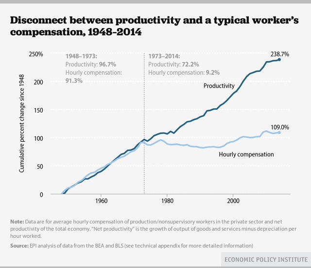
And here's my challenge to you, dear reader, what's wrong with it? Obviously, the authors want us to conclude that productivity has increased substantially while hourly compensation has remained (relatively) flat.
The first thing is told to us in the first note:"Data are for average hourly compensation of production/nonsupervisory in the private sector and net productivity of the total economy." In other words, these are hand-picked data to tell a hand-picked story. They are not a typical worker's compensation. Furthermore, they are comparing apples and oranges: "...compensation of production/nonsupervisory..." (i.e. the proletariat) compared to the "...net productivity of the total economy." Which is to say, the net productivity of everyone's efforts.
Why didn't they compare the average hourly wage of the production/nonsupervisory to the productivity of the production/nonsupervisory? I imagine that would have told a different story.
The next thing is a geometry question: What defines a line? Answer: any two points. In this case, the first point is the period of time between 1948 and 1973, and the is the period of time from 1973 to 2014. If you want to draw a line to point anywhere, all you need to do is find two points that line up that way. Similarly, if you want to make a point about political economy, all you need to do is define two periods of time that in comparison tell the story you want. I would be far more convinced that there is something going on here if the Economic Policy Institute looked at a scale of time far larger than just 66 years. I realize there are limitations to data, but that limitation does not mean that we get to place greater credence on the only two known data sets. In fact, it means the exact opposite.
The third problem is that this graph is remarkably spare in its description of who the production/nonsupervisory people are. What are they doing? Let us take the proverbial ditch digger. Is he more creating more value today than he was in 1965? Are ditches all that more important today than they were in 1965? Should this ditch digger get compensated more tomorrow for doing the exact same work he did yesterday? We have a belief that a worker's wages should increase with time. I will concede that wages should keep pace with inflation, but beyond that the worker's wages should be commensurate with the value he is creating. Are the workers in this graph creating more value? Perhaps.
This brings us to the fourth and final issue with this graph: the compensation is not truly compensation, it is wages. So what? The difference is very important, because compensation includes lots of other things, including health care, Social Security and other things. Look at the chart below, shamelessly lifted from the National Bureau of Economic Research:

You'll see a significant growth in the supplements to wages and salaries of nearly 9 percent. Add to that the fact that compensation in vacation terms increased by another 2 percent. These are not insignificant sums! In fact, in a recent paper by Mark Warshawsky, "Earnings Inequality: The Implications of the Rapidly Rising Cost of Employer-Provided Health Insurance", we learn that if all forms of compensation are included--especially health care expenditures by the corporation on behalf of the employee--wages would have risen by 41% between 1999 and 2006. For the economy as a whole to grow that fast, it would have taken 15 years.
Well there are other arguments one could make, including the fact that the post war period was incredibly profitable for the US, as it took its turn as the world's manufacturing center. It was only in the 1970's that other countries--notably Japan--began to catch up and surpass some of the US's dominance.
Charts like these are very much a single line formed from only the two points that the author wanted us to connect. Despite my nearly pathological aversion and dislike for regulation, I'm almost tempted to ask for a regulation to control the publication of charts in public places, but then, I would only deprive myself of righteous indignation.
No comments:
Post a Comment
Hey, what do you think? Am I completely crazy? Go ahead and say so!
Add a comment today.